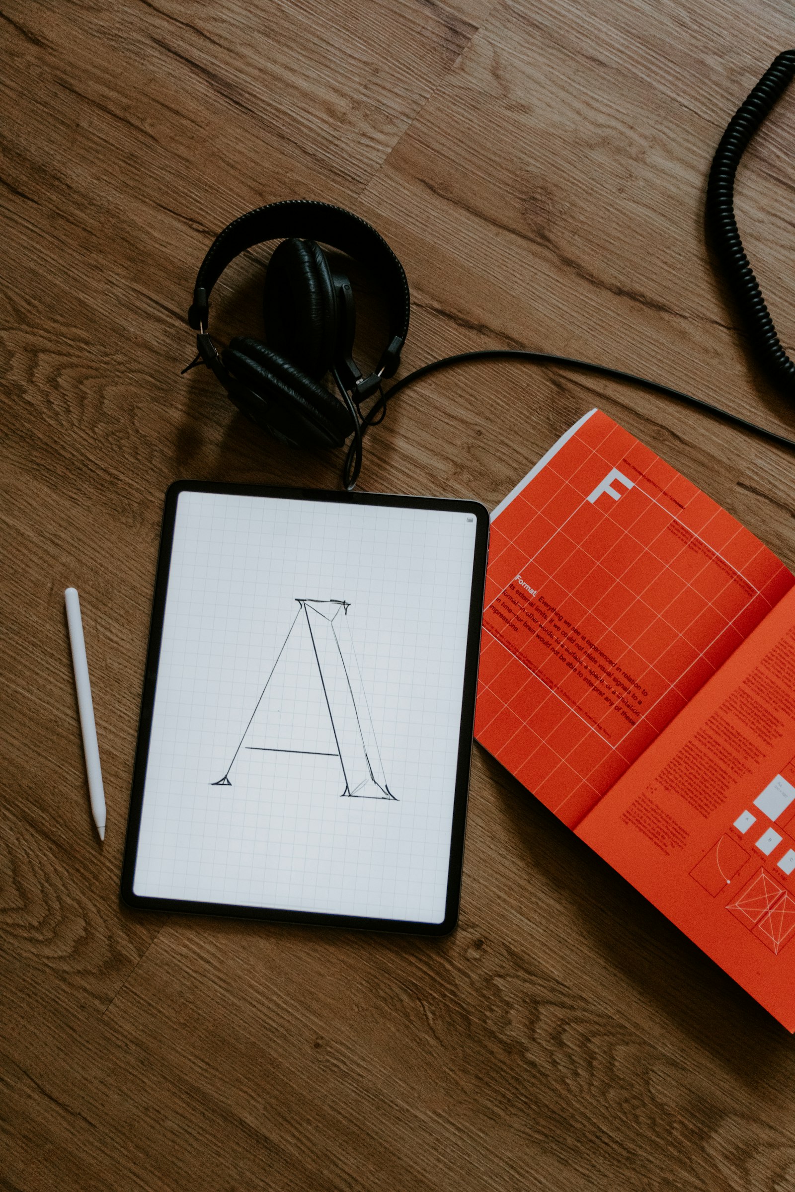
Pairing type for a long read on screen
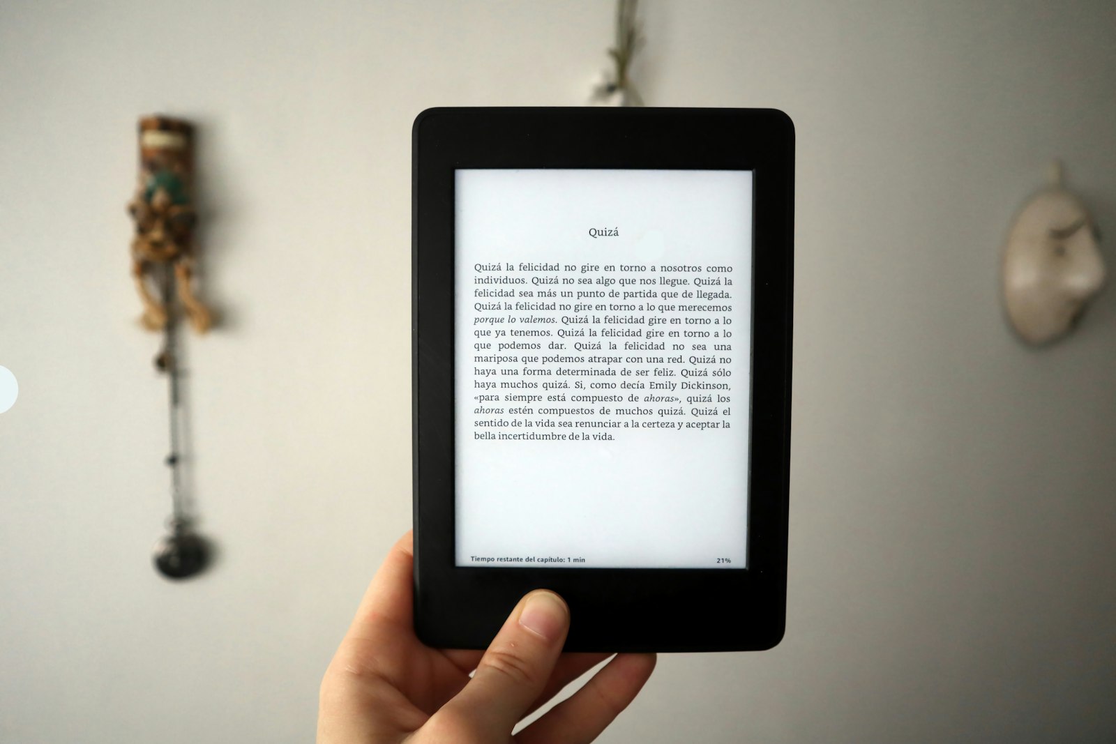
Most type pairings get approved on the strength of a headline and two lines of sample text. That is a fair test for a poster. A long read asks for something different, because the reader spends a few seconds with one face and twenty minutes with the other, on a screen you do not control, often at the end of a tiring day.
We have written before about explaining a typeface choice once you have made it. These notes come earlier in the process: how we would actually choose and test a pair for an article of a few thousand words.
Choose the reading face first, and choose it alone
The usual order is to fall for a display face and then hunt for something quiet to put under it. For long text we would reverse that. The face carrying the paragraphs does nearly all the work, so it should win its place before a heading ever appears.
Pour a real article into a plain page, at least a few screens long, with the headings set in the same face for now. Then look for practical things:
- Tall lowercase and open shapes. Letters like a, e and s should stay distinct at phone size and on a cheap display.
- Letters that do not get confused. Type “Illinois 1l0O” and see whether you can tell them apart.
- A regular weight with some body. Many faces look elegant at specimen size and spindly at reading size.
- A true italic and sensible figures. Long reads are full of book titles, dates and small amounts.
Serif or sans matters less here than people tend to argue. Plenty of each read well on a current phone, and plenty of each do not. Judge the actual face at the actual size.
Set the column and the line spacing before you decide, because a good face in a bad column will still feel tiring. Line length advice for print usually lands between 45 and 75 characters, and the research on screens is less settled. Treat that range as a starting point, then read at the widths your layout really produces.
Give the second face a small, clear job
Once the reading face is settled, ask what it cannot do by itself. In a long read the honest answer is usually wayfinding. Readers skim, lose their place and come back, and they need signs to find their way around:
- Section headings and subheadings.
- Captions, credits and footnote markers.
- Labels, dates and the table of contents.
- The occasional pull quote.
If you can write that list, you know what the second face is for. Sometimes the list shows that you do not need one. A single family with a strong bold, a good italic and some size changes can handle every sign in a long article, with less to load and less to go wrong.
Match proportions before you match style
Advice on pairing often talks about mood and historical period. On screen, in small sizes, the practical relationship comes first. Two faces at the same nominal size can look like different sizes, because their lowercase letters differ in height. A caption set in a sans with tall lowercase can look louder than the serif paragraph above it, even when its number is smaller.
So tune by eye, side by side, looking at three things:
- Apparent size. Adjust until a small-size label and the body text feel like they belong to the same page.
- Colour. Blur your eyes and look at the grey of each block of text. A subheading should be clearly darker than the paragraph, not just a little heavier than it, and a caption should be a little lighter.
- Width. A wide display face takes far more room than a narrow text face, and on a phone that decides how many lines a heading takes.
Then check the distance between the two. Pairs tend to work when they are clearly related or clearly different. Two similar sans-serifs, slightly apart, often read as a mistake.
Test the joins, not the specimen
A pairing lives or dies where the two faces meet, so build a test page out of those meeting points. Take a hypothetical long read on the history of a ferry line, and include:
- The longest real heading, set at phone width. Does it wrap to five lines, or push a long word off the edge?
- A subheading directly after a paragraph and directly before one. Does the gap make clear which text it belongs to?
- A caption under an image, with a long credit and a date.
- A paragraph with a bold phrase, an italic title, a link and a number, all in the same line if you can manage it.
View that page on an older phone at normal brightness, as well as on your good monitor. If the design has a dark theme, test it separately, because light text on a dark ground can look heavier or thinner than the same weight on white, and a pair balanced for one may be out of balance in the other.
Then do the test most people skip: read the whole thing. Send the page to your phone and read it where you would read an article, on the sofa or on a train. Note where you stopped, what you noticed and when you started noticing nothing at all, which is the good part. That is no laboratory measure, only a way of catching what a quick look misses.
Count what the pair costs to load
On the web, a second family is also a second set of files. Each style is more to download, and a long read loses some charm if the text jumps while somebody is on the second sentence.
That jump usually comes from the swap: the browser shows a fallback font, then replaces it once the web font arrives. MDN’s page on font-display explains the options. A few habits keep the damage small:
- Load only the weights and styles the design uses, and remove the rest once the design has settled.
- Pick a fallback with similar proportions to the web font, so that the swap moves as little as possible.
- Check that the bold and italic you see are real. If a style is missing, browsers can fake it, usually with a clumsy result.
- Make sure both faces cover every character you need. If only one has your accented letters, a fallback may slip into the middle of a word in a heading.
Show the pair the way it will be read
When you post a pairing, the temptation is to show the handsome headline crop again. Give readers the long view as well: a full-length screenshot at real size, a phone crop of a heading meeting its paragraph, and a sentence or two on what each face is for. Longer posts on RyeType get a table of contents from their section headings, so a reader can jump straight to your type section.
If you want opinions before you commit, ask something a reader can answer. “Does this work?” invites a verdict. “At phone width, does the subheading feel too heavy after the body text?” invites a useful reply. Our notes on sharing work in progress have more on asking that kind of question, and replies appear once a moderator has read them.
A long-read pairing has done its job when nobody mentions it. The reader remembers the ferry line, finds the section they wanted to reread, and never once thinks about the type, which is a strange kind of success to put in a portfolio.