
Explaining a typeface choice in plain words
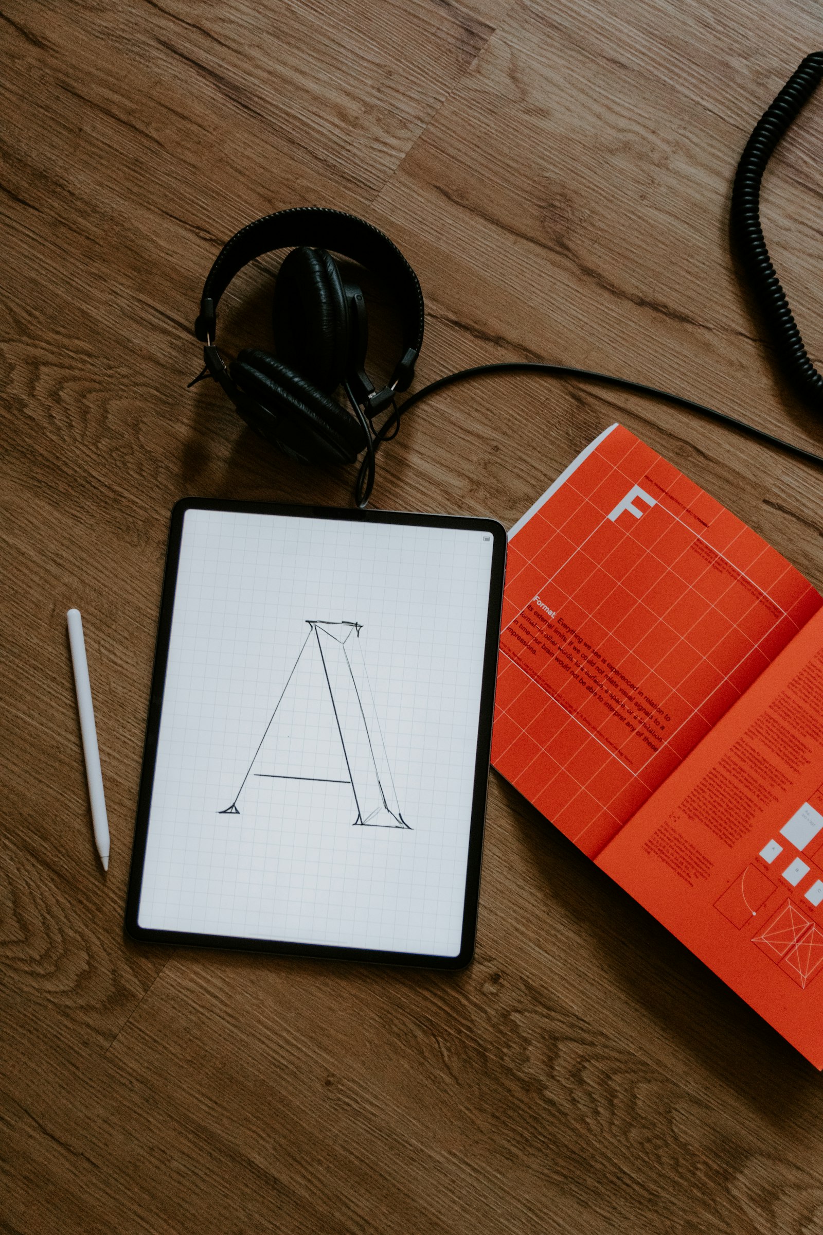
Ask a designer why they chose a typeface and you will often get one of two answers. The first is a shrug: “It just felt right.” The second is a lecture on x-heights, apertures and the history of a foundry, delivered to someone who only wanted to know whether the menu would be readable. Neither answer helps the person asking.
Explaining a type choice well is a small, useful skill. You need it in case studies, in client presentations, in the description under a shot, and in your own notes when you come back to a project a year later. Here is how we would approach it.
Begin with the job the type has to do
Every typeface on a project is hired for a job. Before you say anything about its shapes, say what the job is. A few examples of jobs, stated plainly:
- Set long articles that people read on their phones in the evening.
- Make a price, a time and a platform number readable from across a station.
- Give a small bakery’s labels a warm, hand-made feeling without looking messy.
- Sit next to a strong logo without competing with it.
Once the job is on the table, the choice becomes something a reader can judge. They may not know what a ball terminal is, but they know what it is like to squint at a timetable.
Name two or three qualities, in words anyone can follow
You do not need to avoid technical terms, but each one should arrive with its meaning attached. Compare these two sentences:
We chose it for its large x-height and open apertures.
The lowercase letters are tall compared with the capitals, so text stays readable at small sizes, and letters like c and e have wide openings, which keeps them from blurring together on low-quality screens.
The second is longer, but every reader leaves with something. Designers will recognise the terms behind it; everyone else learns why it matters. If you like, use the term and the explanation together: “a large x-height (the lowercase letters are tall)”.
Pick only the qualities that served the job. A face may have beautiful italics, but if the project never used italics, leave them out. Two or three relevant reasons are more convincing than a list of every virtue on the specimen page. Wikipedia’s article on typeface anatomy is a handy reference if you want to check a term before you use it.
Show the alternatives you set aside
A choice only means something next to what was not chosen. If you tried three faces before landing on one, say so, and show them. A simple comparison image does a lot of work: the same headline and paragraph set in each candidate, at the size it will really be used.
Then explain, briefly, why each one lost:
- “Too narrow: long German words broke awkwardly in the column.”
- “Lovely in headlines, but the figures were too small for the price list.”
- “Missing the Vietnamese diacritics we needed for the second edition.”
That last kind of reason is worth taking seriously. Language support is one of the most practical grounds for a type decision, and one of the least often mentioned. If the project has to set accented text, check every character you will need, including stacked marks, before you fall in love with a face. Say in your write-up that you checked.
Explain the pairing, not just the faces
Most projects use more than one typeface, or one family in several weights and styles. Readers often find the relationship more interesting than the individual choices. Why does this serif sit well with that sans? What does each one do that the other does not?
Useful ways to describe a pairing:
- Contrast of role: one face for reading, one for finding (headings, labels, navigation).
- Shared structure: similar proportions or stroke contrast, so they feel related even though they differ in style.
- Contrast of voice: a formal text face against a more informal display face, used deliberately and sparingly.
Show the pair working on a real layout, not on a specimen sheet. Type choices are judged in context, and a heading-and-paragraph pair looks very different in a dense app screen than on a generous poster.
Be honest about taste and practical limits
Not every reason is rational, and you do not need to pretend otherwise. Sometimes a face simply had the mood you wanted, and the honest sentence is “we liked how it felt next to the photography”. Say it, and then add whatever practical checks you did to make sure the feeling did not cost readability.
Practical limits deserve a sentence too. Licensing, budget, web performance and what the client’s team can install on their own machines all shape type decisions. “We used a free family so the client’s in-house team could keep making materials after the project ended” is a real design reason, and a generous one. Always respect a face’s licence when you show it in your post, and credit the type designer or foundry by name where you can.
Write it short, then show it large
In most write-ups the explanation for a type choice can fit in a short paragraph or two, followed by a good image. A pattern we like:
- One sentence on the job.
- Two or three sentences on the qualities that suit it.
- One sentence on what you set aside and why.
- A large, real-size image of the type in use.
If you write in a case study, the type section is usually one decision among several; our notes on writing a design case study show where it fits. If you are writing a stand-alone post about a single type decision, you have room to go deeper, with process images and the specimens you printed and marked up.
Whatever the length, the aim is the same. Someone who has never opened a font menu should finish your paragraph understanding why the words on the page look the way they do. Someone who opens font menus every day should finish it nodding, and perhaps disagreeing with you in the comments, which is a perfectly good outcome too. On RyeType, comments from readers are approved by moderators before they appear, so expect a short wait before that conversation starts.