Showing a redesign without trashing the old version
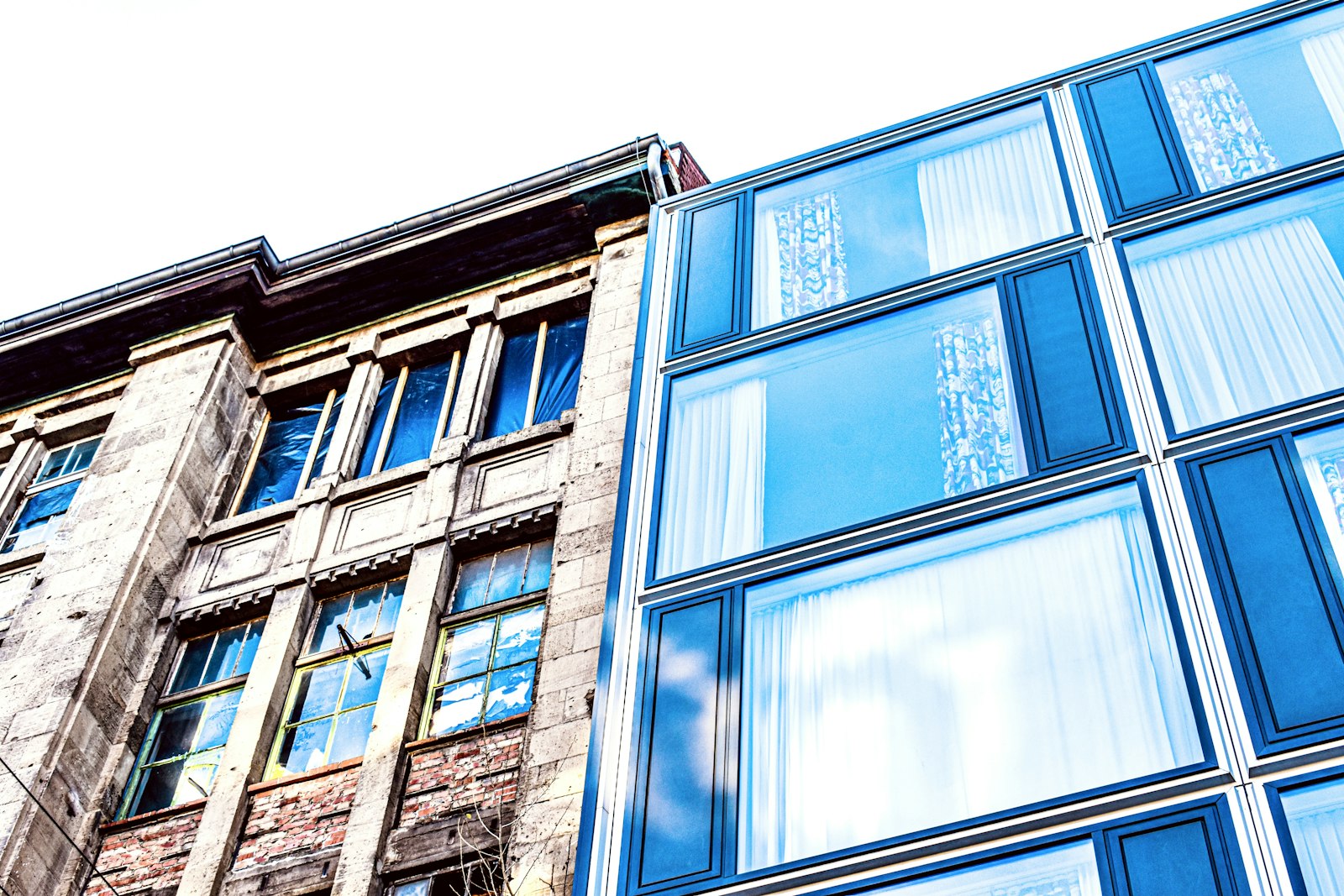
The before-and-after is the most satisfying shot in design. Drag the slider, watch the cluttered thing turn calm, collect the applause. It is also the shot most likely to make its author look small, because the easy way to make the new version shine is to make the old one look foolish.
Somebody made that old version, maybe under a deadline you never saw. Sometimes that somebody is the client sitting across from you, and sometimes it is you, four years younger. Readers notice the sneer even when they cannot say where it is, and a future client reading it will reasonably wonder how you will describe their work once you have moved on. Here is how we would show the change and leave the old design its dignity.
Give the old version its context first
Every interface or identity made sense to someone at the moment it shipped. Before you show a single comparison, spend a few sentences on the world the old design was built for. How many products did the company have then? Which devices did its customers use? What was the team asked to do?
Take a hypothetical ferry operator. Its old timetable page is a dense table with tiny type, and on a phone today it looks awful. Now add the context: it was laid out when most passengers planned their trip at a desk, and it was built to mirror the printed leaflet at the ticket office. Suddenly the table reads as a reasonable answer to an older question. Your redesign answers a new one, asked by someone on a windy quay with one hand free.
This framing also happens to be more accurate. Most redesigns exist because the situation moved, and saying so explains your work better than any verdict on the past could.
Compare like with like
The quietest way to trash an old design is in the image itself. Designers rarely do this on purpose, but the habits are easy to fall into:
- A blurry, low-resolution screenshot of the old version next to a crisp render of the new one.
- The old page full of real, messy content, the new one filled with tidy sample text and one perfect photo.
- Old work shown flat and small, new work on a lovely device in soft morning light.
- A worst-case screen from the old version, paired with the best screen from the new.
A fair comparison keeps everything the same except the design. Use the same screen size, the same crop, the same scale and the same content, right down to the longest product name in the catalogue. For type work, set the same paragraph at the same physical size. For a logo, show both at the small size where it actually lives, beside the large version.
Fairness pays you back here. If the new version wins when both sides carry the same awkward content, the reader believes it. If it only wins with placeholder text, a careful reader will suspect that, and so should you.
Pair each change with a reason
“Before” and “After” are poor captions, since they tell the reader which picture is which and nothing else. Treat each pair as a small argument: what changed, and what prompted it. Compare these two captions for the same hypothetical pair:
The old header was cluttered and confusing, so we cleaned it up.
The header had grown to nine links as new services were added. Most visits now start on a phone, so the three things people came for moved up front and the rest went into a menu.
The first judges and explains nothing. The second describes how the clutter came about, which is almost always more interesting than the clutter itself, and it gives a reader something to disagree with. Our notes on writing a design case study go further into laying out a decision, including what each one cost. A redesign has costs too. If the new layout shows less at a glance than the old table did, and some regular users will miss that, say so.
You will probably need several pairs. One grand slider across the whole homepage hides the decisions, while three or four close crops of specific parts show them: the navigation, a form, a heading and its body text. Label anything you recreated rather than captured, so nobody mistakes a mock-up for the historic record.
Name what you kept, and why
Very few redesigns throw everything away, and the parts that survive are often the most telling. The old colour may have been so well known to customers that you were right to leave it alone. A clumsy-looking form might have asked its questions in exactly the right order, and you simply gave that order better spacing.
Say this out loud. A short paragraph on what the earlier designers got right does two useful things at once. It is generous, and it shows you studied the thing before you started changing it, which is the first thing a thoughtful client hopes to hear. Type is a good place to look: if you kept a face from the old system, or chose its near relative, explain why in the plain terms we suggest in explaining a typeface choice.
When the old version belongs to someone else
A redesign of your own earlier work gives you plenty of licence. You can be funny about it, and readers tend to enjoy watching a designer wince at their own drop shadows. That same joke lands very differently when it is aimed at a colleague or an agency that held the account before you.
A few habits keep you on safe ground when the “before” came from another hand:
- Credit the earlier designers if you know who they were and they would be happy to be named. Our community guidelines ask you to credit other people’s work clearly whenever you show it.
- Check that the client is comfortable with the comparison. A public post picking over their old site may not be something they want, however gently it is written.
- Describe limits you can verify, and leave out guesses about budgets, skills or motives. You were not in that room.
- Say plainly which parts of the new version are yours, and which were carried over.
Read it back as the person who made the old one
Before you publish, read the draft as if your own work were on the left. Look for these tells and rewrite them:
- Words that grade the past: “dated”, “ugly”, “a mess”, “desperately needed”.
- Claims of rescue, such as “we saved” or “finally brought into this decade”.
- Results you cannot source. “Bookings went up” needs a real number from someone who measured it, or it needs to go.
- Any sentence that only works if the old team was careless.
Most of these fixes are small. “The old checkout was a nightmare” becomes “The old checkout asked for an account before it showed the price, which made sense when most orders came from returning trade customers.” The second sentence is longer, says far more, and would not embarrass you if its author read it over your shoulder.
Then look at the two images one last time. A good before-and-after leaves the reader thinking the new version is better for now, for these people, and that the old one did a decent job in its day. If someone who worked on the old design could read your post and reply with a nod, you have written it well. They may even tell you something you did not know about why it looked that way, and on RyeType that reply will be there under the post once a moderator has read it.